Building Tokopedia's AI Trainer
Tokopedia's data labeling team was spending over 2 minutes per image using a third-party tool that couldn't be customized for their workflow. We designed and shipped an in-house annotation platform that cut labeling time by 75%.
Role
Senior Product Designer — research, design, user testing, and delivery
Duration
Q3 2020
Team
1 Product Designer, 1 UX Writer, 2 Front-End Engineers, 1 Product Manager
Platform
Web Application
75%
Reduction in labeling time
30s
Avg. time per image, down from 2 min
~$60K
Est. annual Labelbox Enterprise licensing cost eliminated*
Why did this project exist?
Tokopedia's AI and machine learning capabilities depend heavily on high-quality image training data.
On this occasion, the Marketplace has a need to labeling images on the products published by sellers with the aim of enhancing features that will make it easier for sellers in the future.
The accuracy of an AI algorithm is influenced by the quality and quantity of the training data provided to it. The more attributes that are associated with the data, the more comprehensive and valuable the dataset becomes.
At the same time, Tokopedia Enterprise had a larger ambition: to build and eventually sell this annotation platform externally to other companies that need data labeling infrastructure.
Why do we need to build this?
Developing AI trainer allows Tokopedia to have more control over the process and ensure that their image annotation is consistent and reliable.
Ultimately, the aim is to improve the user experience by accurately identifying and categorizing images, which can help with search functionality and provide more relevant product recommendations to customers.
What the labelers were feeling
I interviewed 5 internal data labelers to understand their day-to-day experience. These were the people who sat with the tool for hours every day, and they had a lot to say.
Three themes emerged consistently across all interviews.
Project setup couldn't support conditional classification logic.
Labelers had no way to avoid images that couldn't be annotated.
Progress and accountability were invisible.
Co-Design Workshop
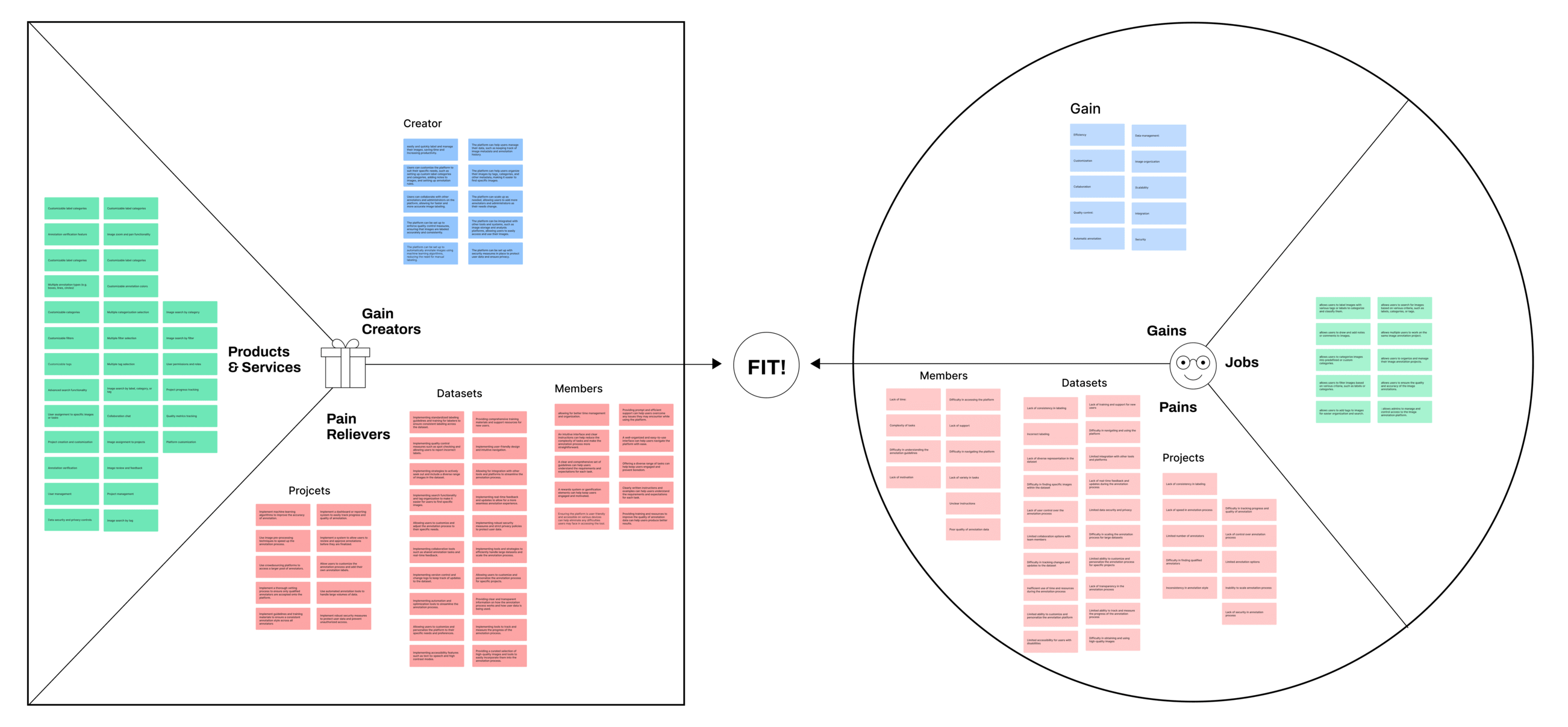
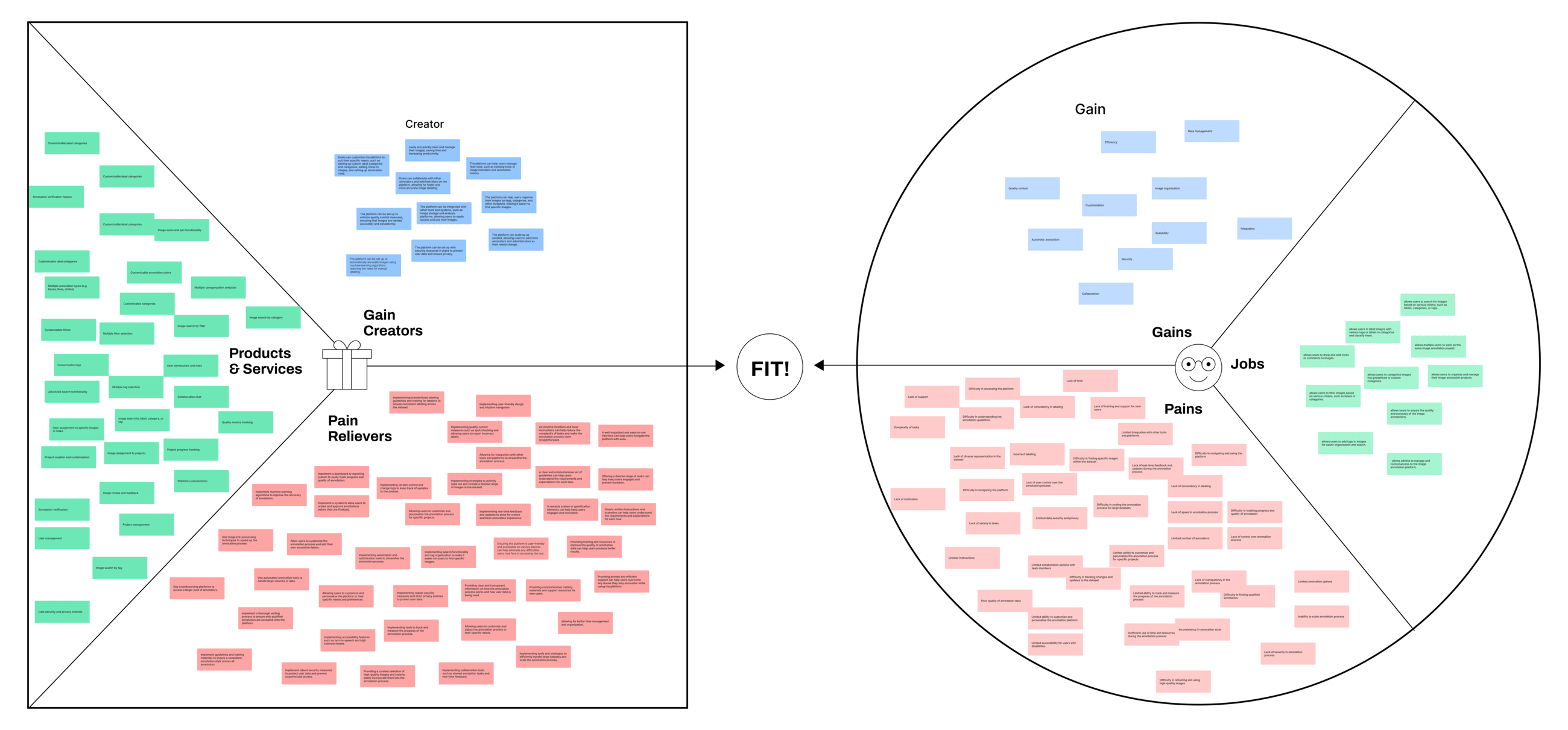
To align the team around a shared understanding of the problem before touching any design tools, I facilitated a Value Proposition Canvas (VPC) workshop with the 10-person cross-functional team: Product Manager, Engineers, and myself as the designer.
The workshop served two purposes: first, to map the labeler's jobs-to-be-done, pains, and gains; second, to define what our platform would uniquely offer especially in the context of it eventually being sold externally.
Balancing Risk to Gain Reward
Rather than designing everything at once, I worked with the PM to define the MVP: the smallest version of the platform that would meaningfully improve labeler productivity and unblock the team from Labelbox.
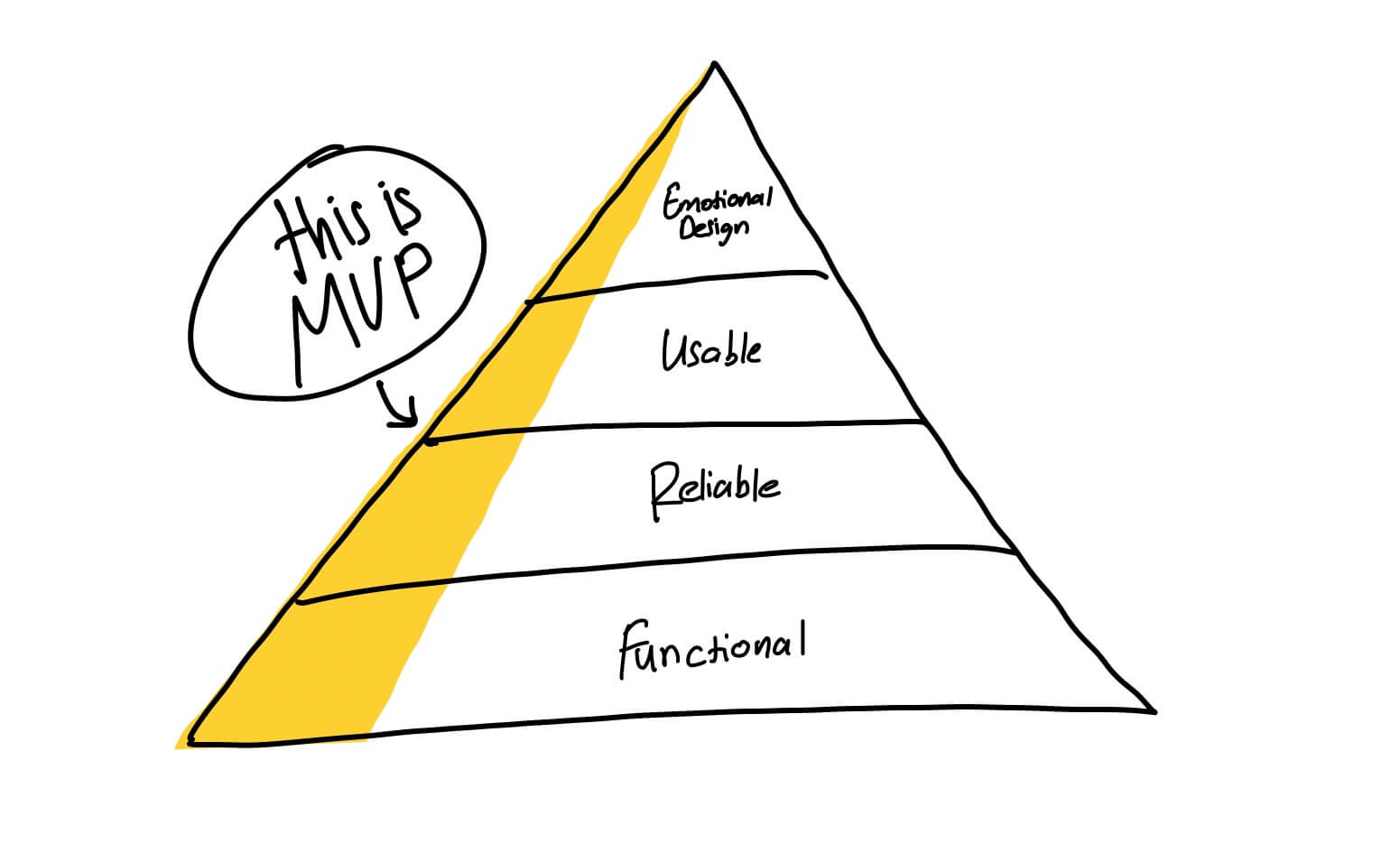
- Project management
- Dataset management
- Member management and role permissions
- Analytics dashboard for labeling progress and accuracy
- Label quality review and approval workflow
- Bulk product selection and batch labeling
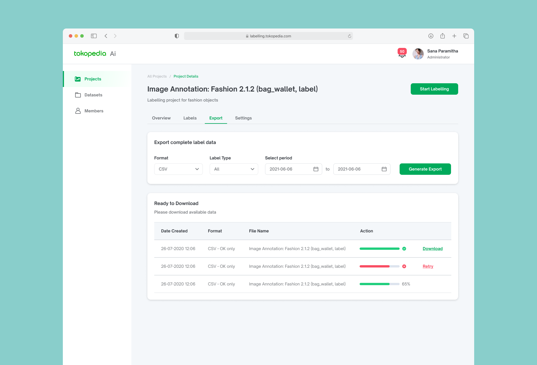
- Export and API integration for ML pipeline
Identifying the Features to Build
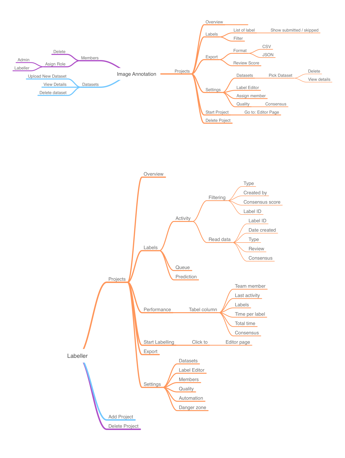
To make sure the MVP scope was complete and nothing was overlooked, I built a feature mind map covering all modules: Projects, Datasets, Members, and the Labeling Editor.
This also helped the engineering team scope their work and identify potential technical dependencies early.
Design Exploration
Mapping the Labeler's Journey
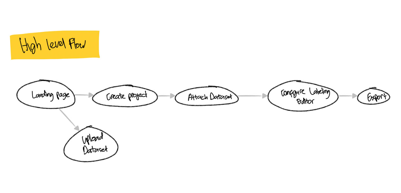
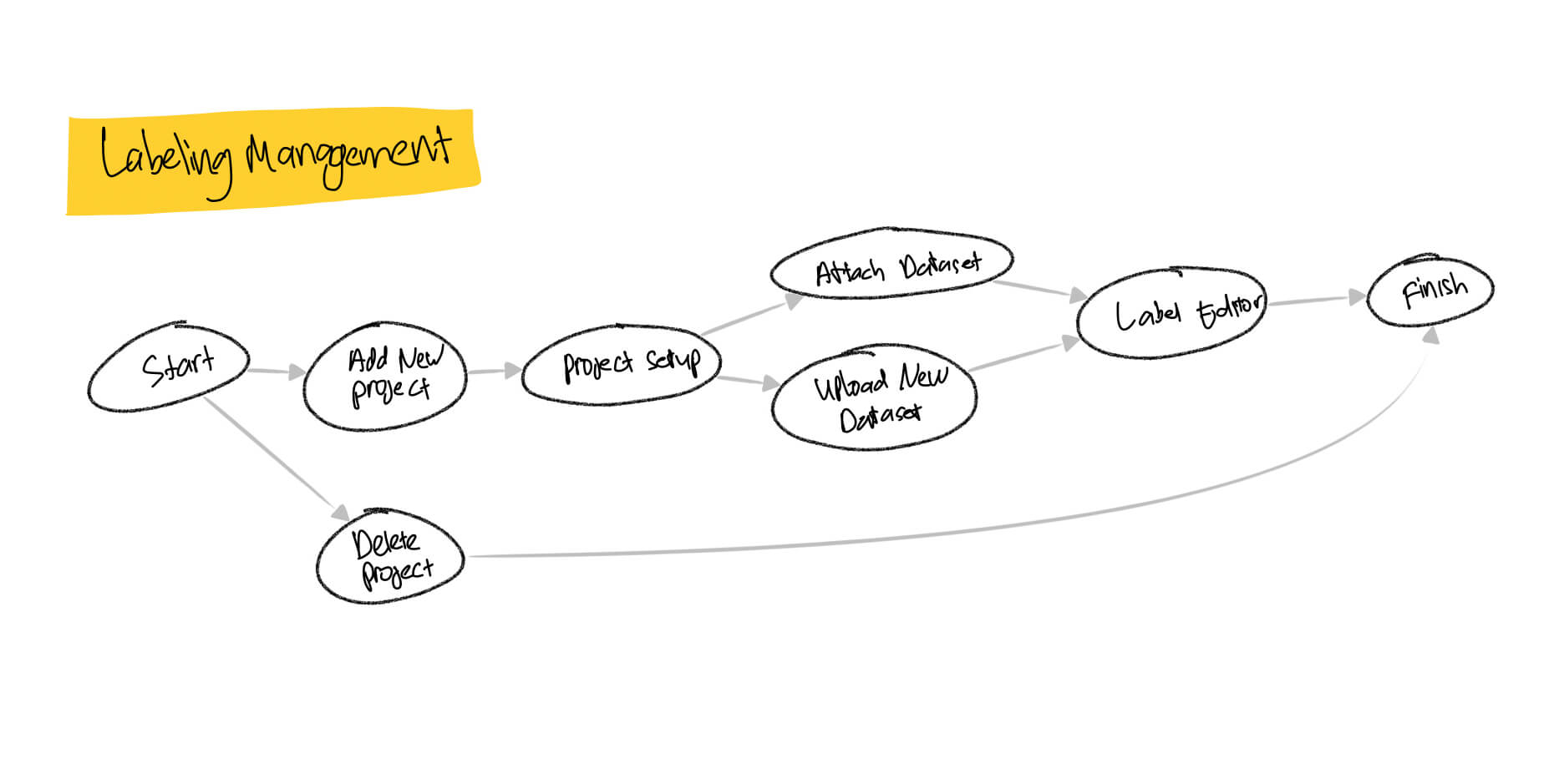
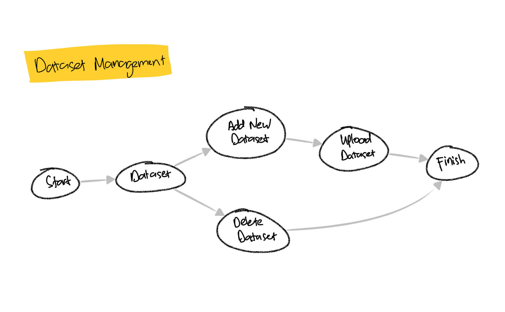
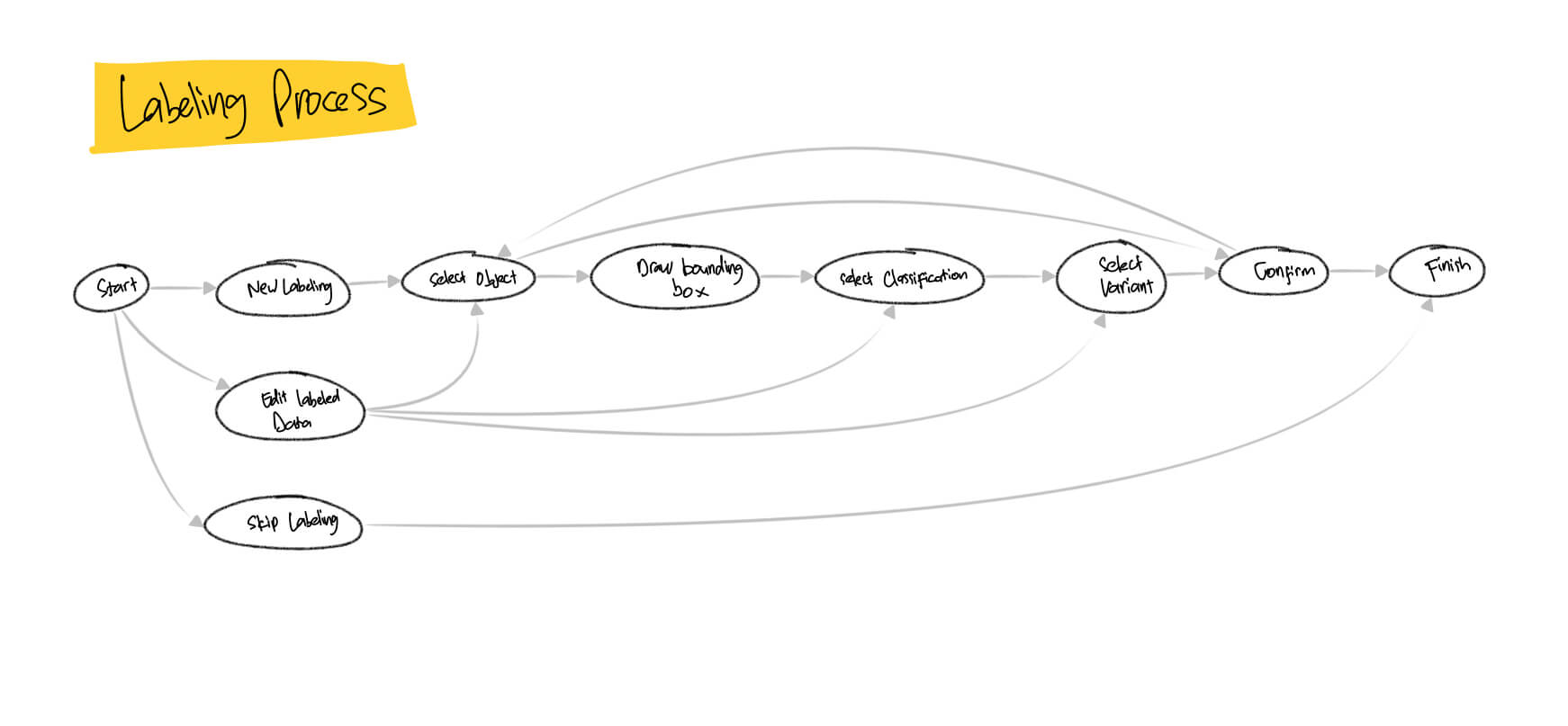
I mapped out the end-to-end flow a labeler would take: from receiving a project assignment, selecting images, annotating them in the editor, to submitting for review.
The flow also covered the admin side: how a project lead would create a project, upload a dataset, and assign members. Having this mapped out upfront exposed a few decision points I hadn't considered — for example, what happens when a labeler tries to annotate a product with no stock, or how we handle images that were already labeled by someone else.
Communicate ideas and get feedback early
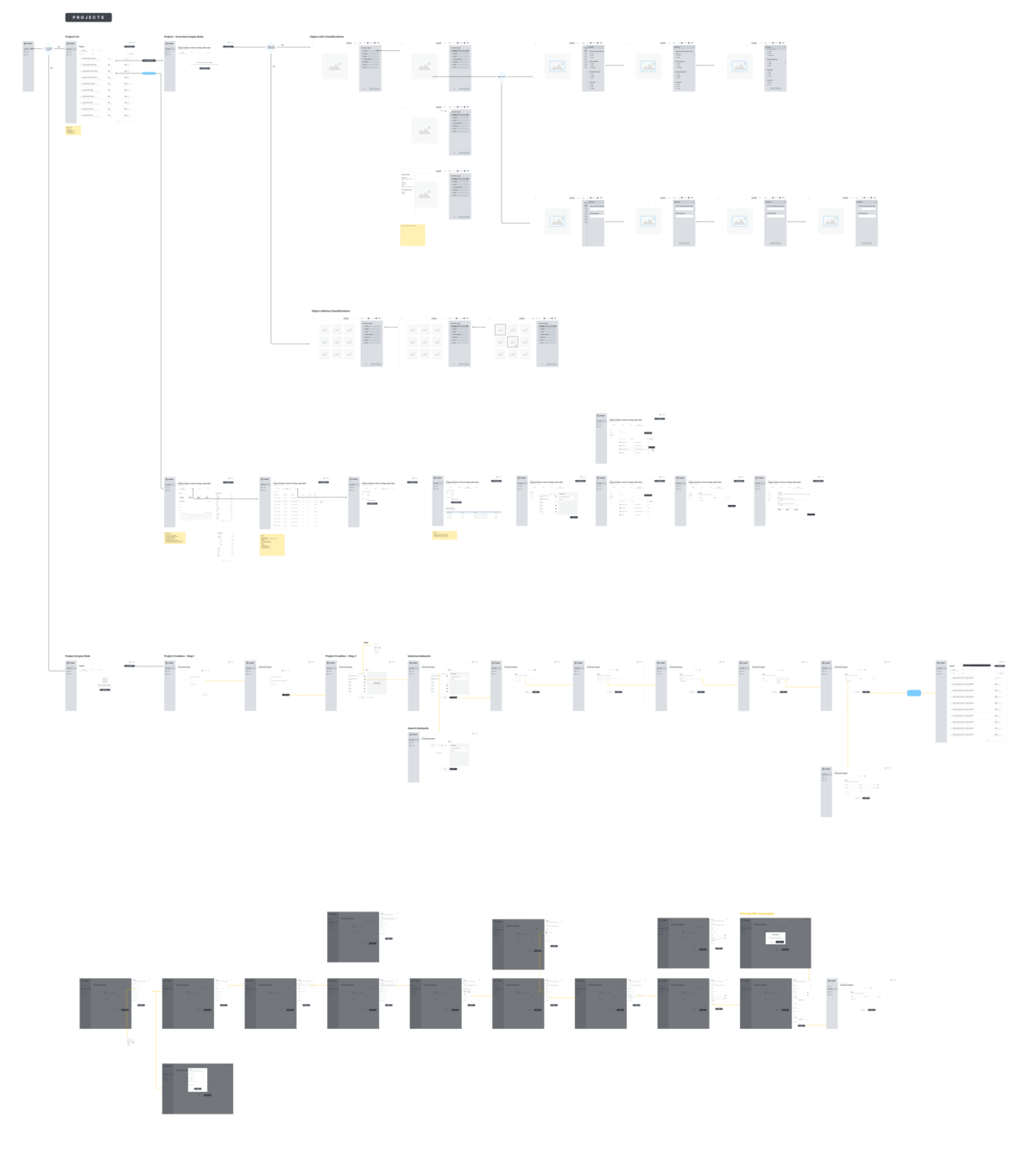
I built wireframes at mid-fidelity before moving to high-fidelity, specifically to validate the information architecture with the PM and engineering team early.
Two things changed significantly after wireframe review:
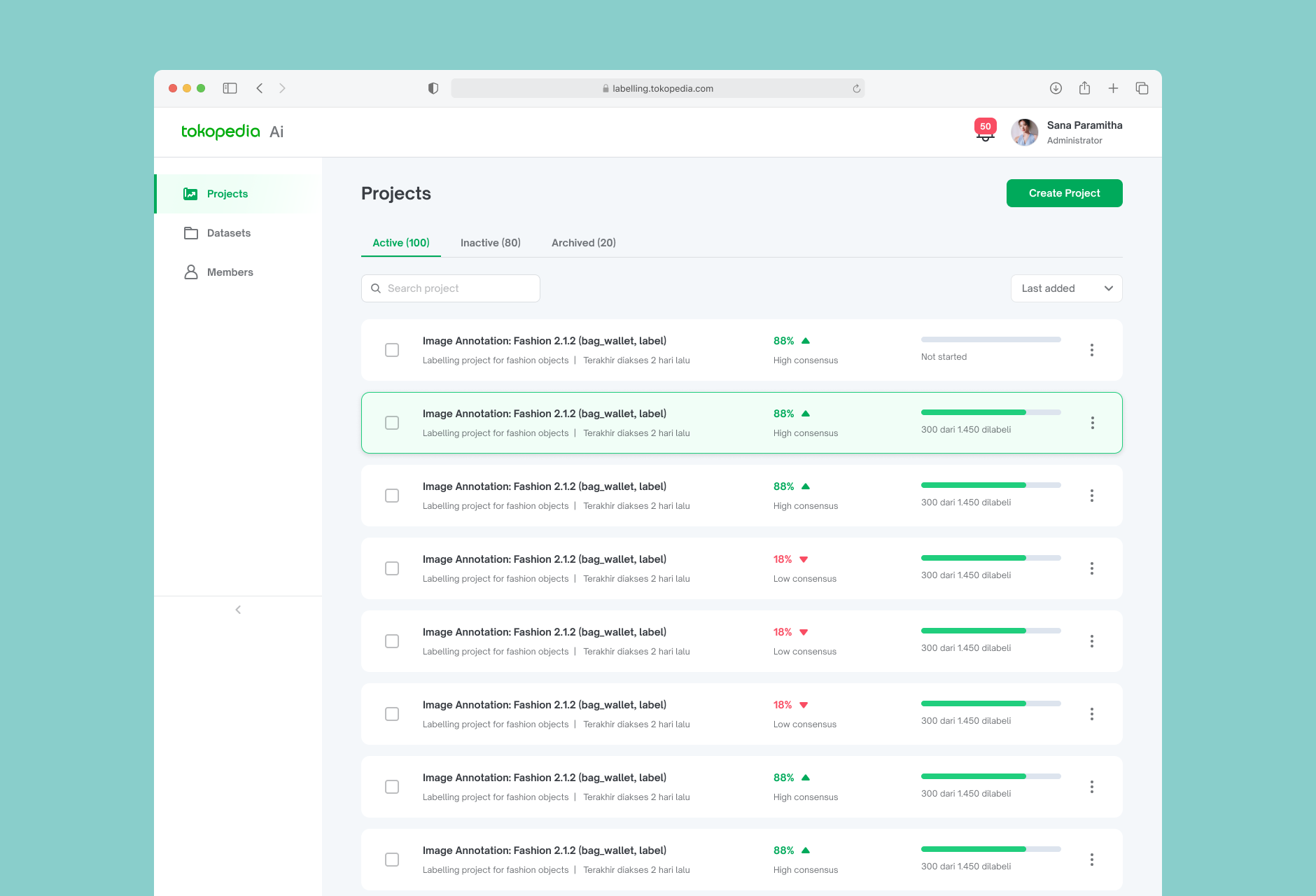
1. Project list layout — started as a card-based grid. After feedback, we landed on a semi-table card approach — each project is still presented as a card, but the internal layout is structured and scannable like a table row: project name, dataset size, labeled vs. unlabeled count, and status all aligned in a consistent pattern. This gave labelers the familiarity of a card with the scannability of a table, without the visual heaviness of a full data grid.
2. Labeling editor layout — initially designed as a three-column layout: an image info pane on the left, the image annotation area in the center, and the label panel on the right. During review, it became clear that the image annotation area needed to be the dominant focus. The final layout deprioritized the info pane by collapsing it into a less prominent position, freeing up more horizontal space for the annotation canvas where labelers spend the majority of their time.
Final Design
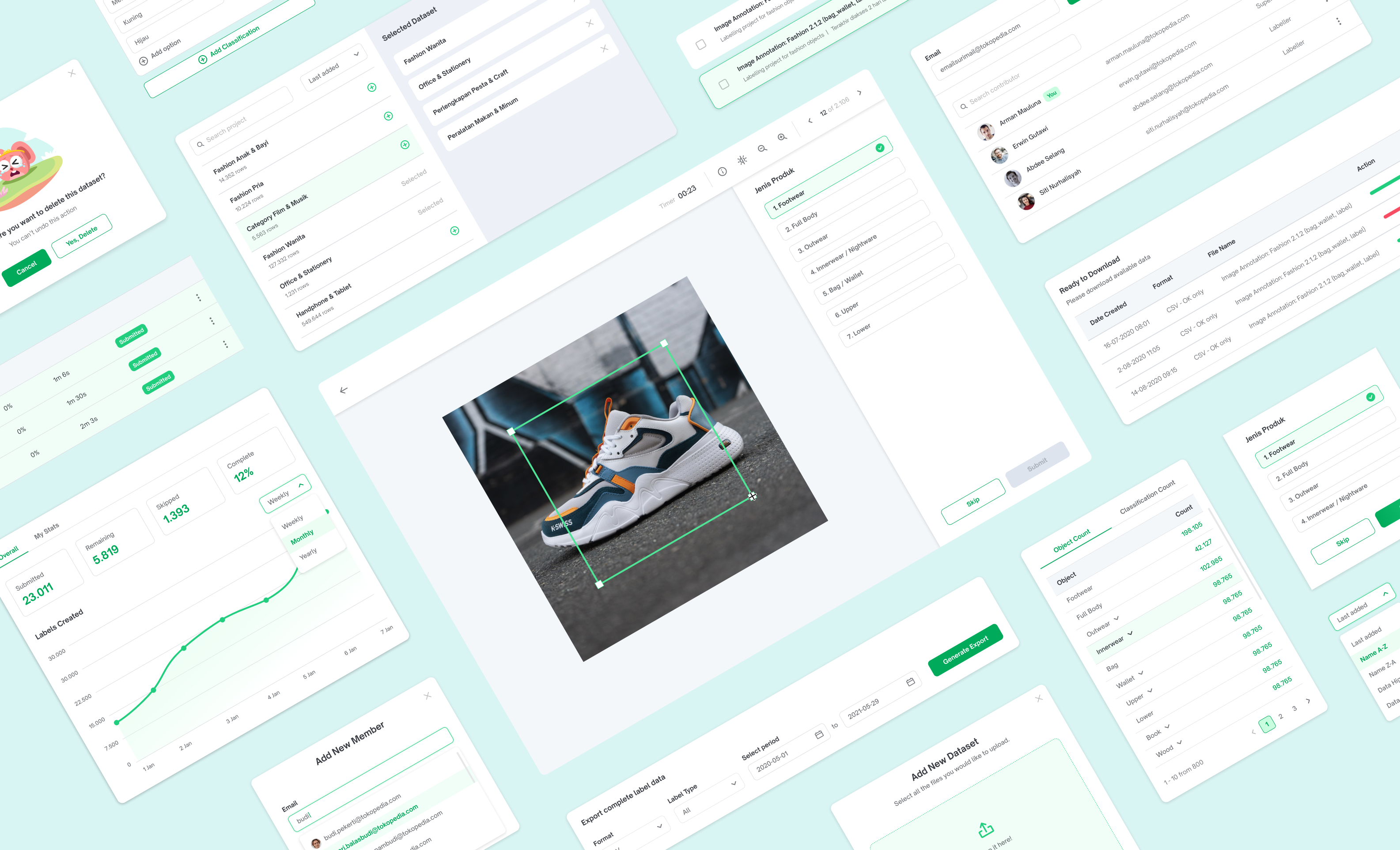
I designed the final UI following the Tokopedia Design System, extending it with new components specific to the annotation context — particularly the label editor toolbar and the multi-select product grid.
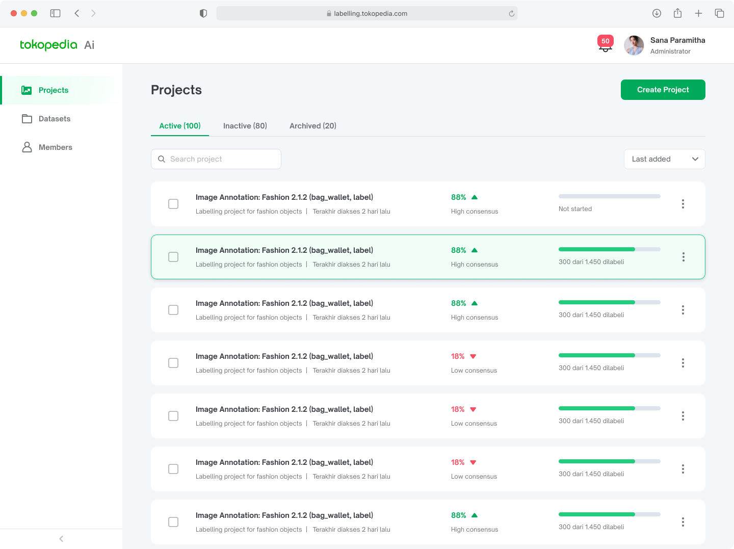
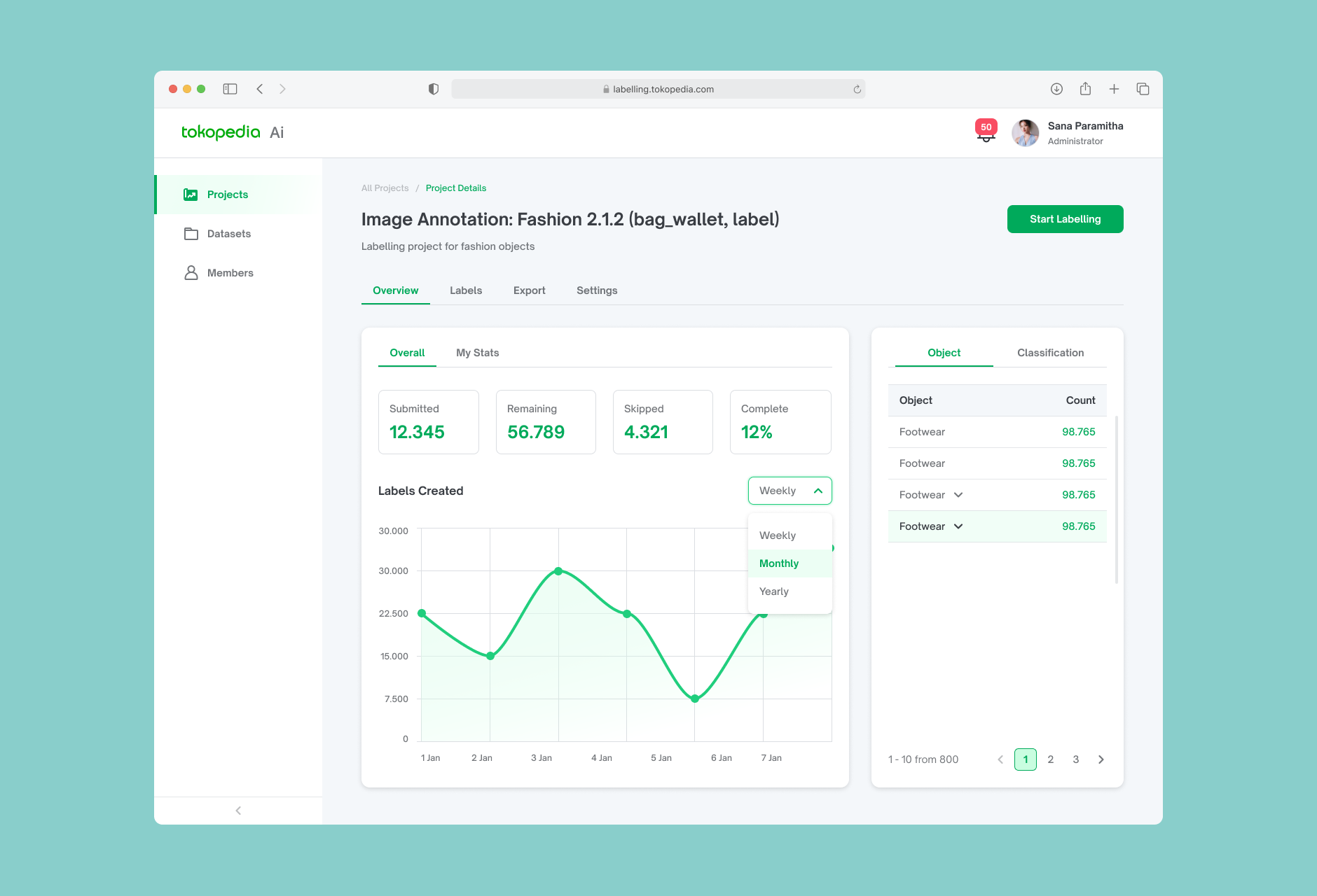
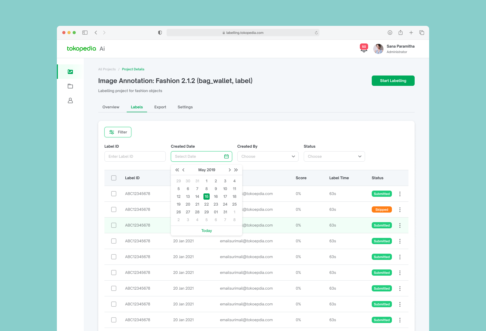
A project list of image annotation is a collection of images that have been labeled or annotated with relevant information. This information may include identifying objects or features within the image, describing the overall scene or context, or providing additional details about the content or purpose of the image.
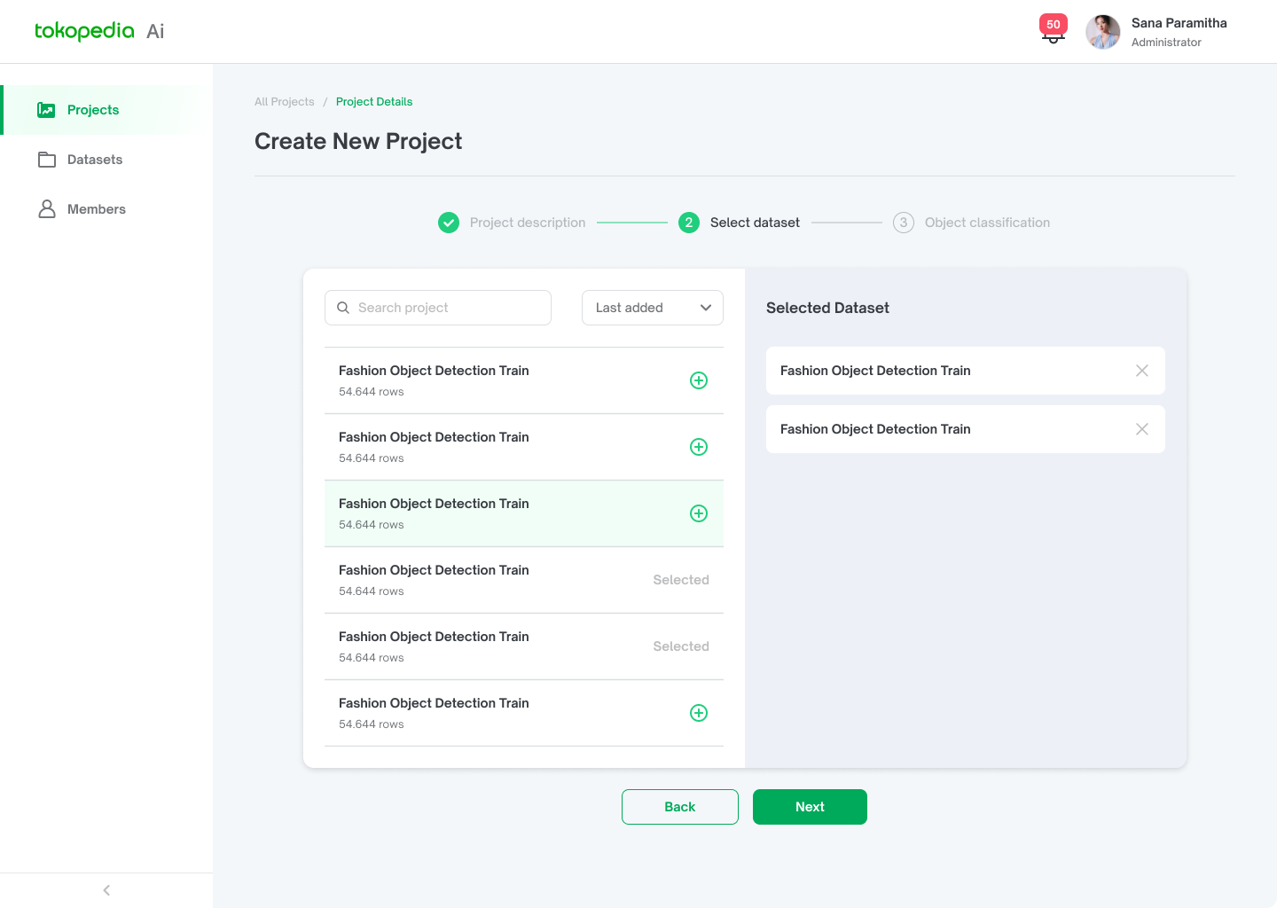
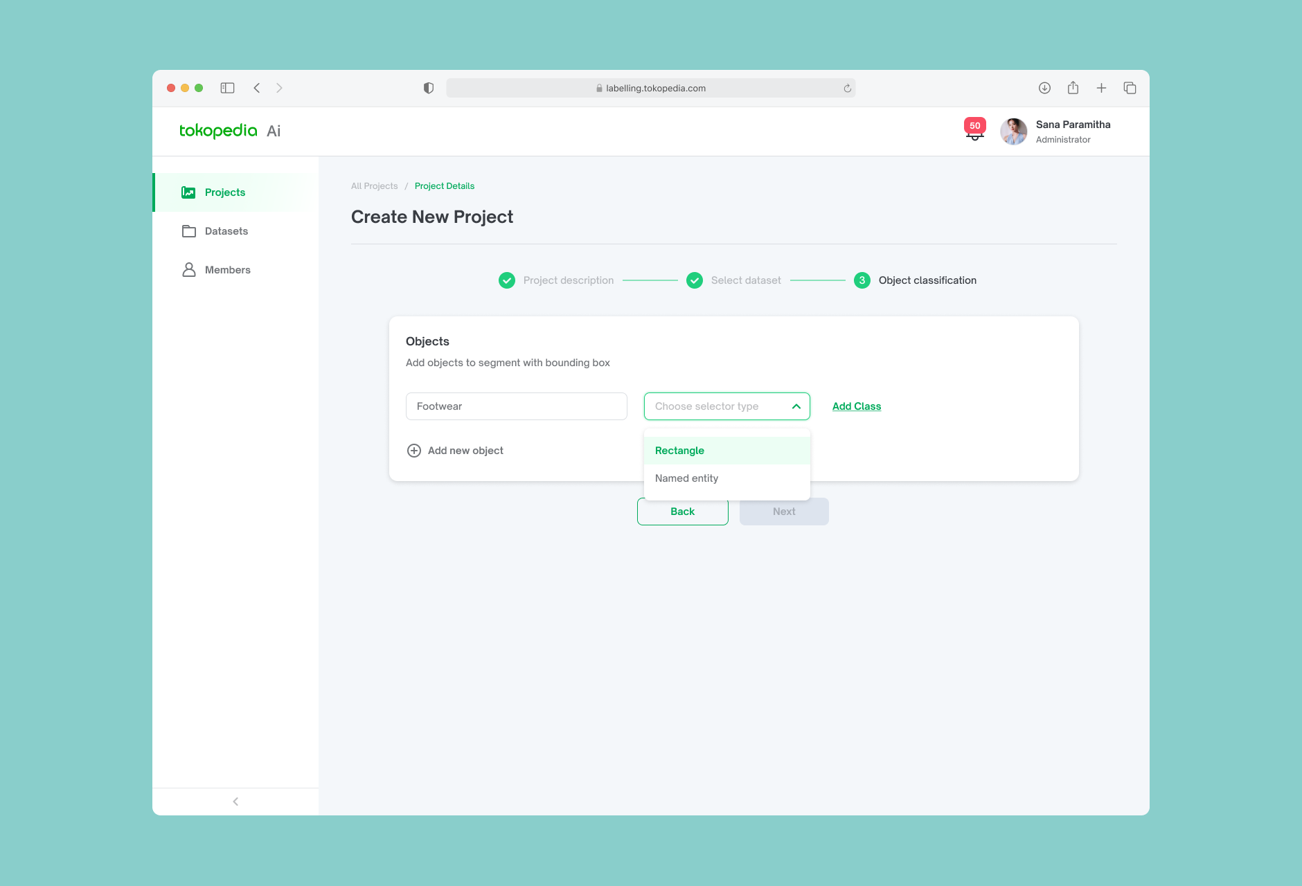
A step-by-step creation flow that lets project leads define the project name, upload a dataset, configure label categories from Tokopedia's taxonomy, and assign labelers — all in one flow without needing to leave the page.
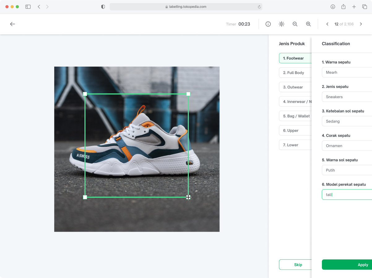
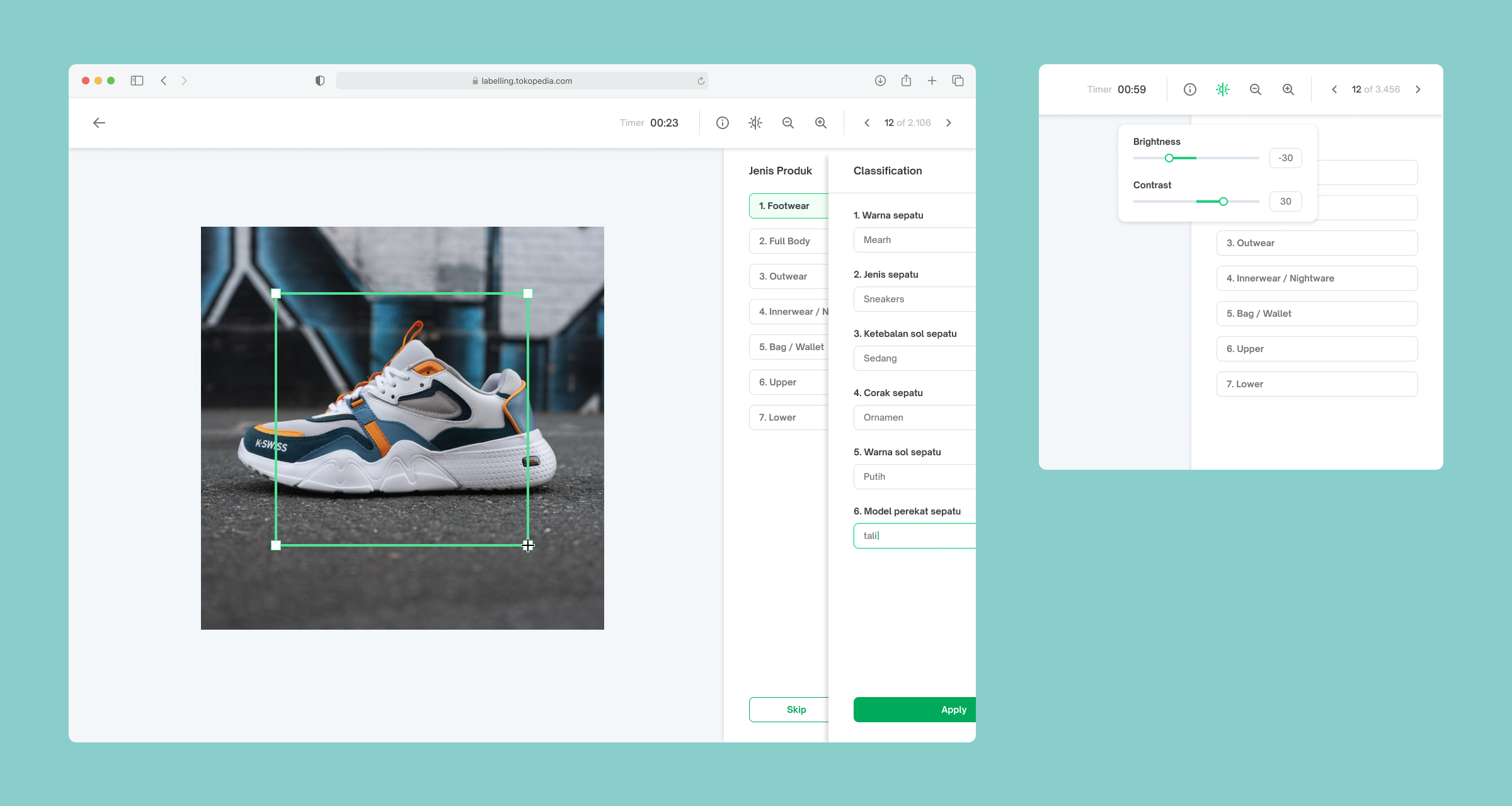
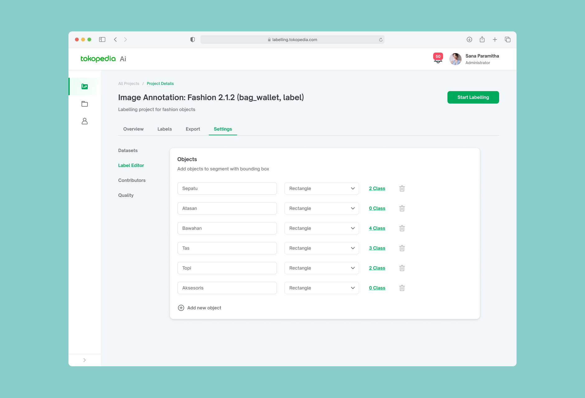
The core of the product. The editor gives labelers a large, clean canvas with the label taxonomy panel accessible on the right.
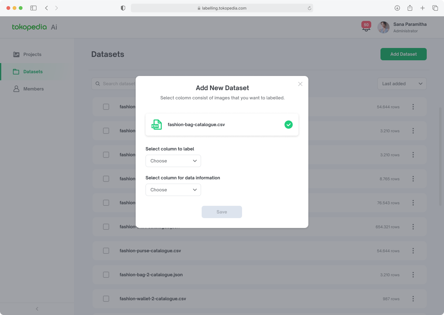
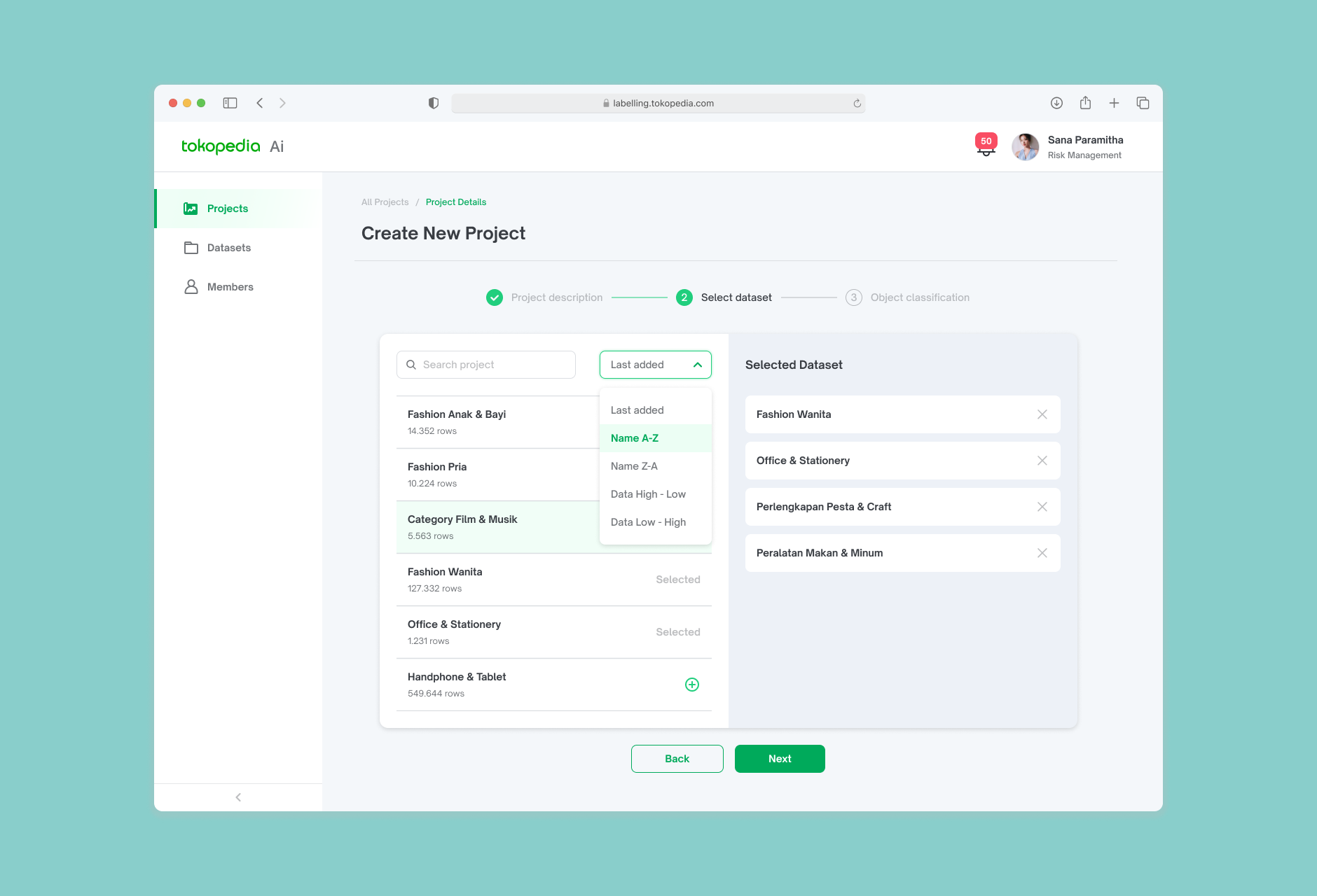
Dataset refers to a collection of images that have been annotated or labeled with additional information. This additional information could include things like object boundaries, object classes, or other relevant attributes of the images.
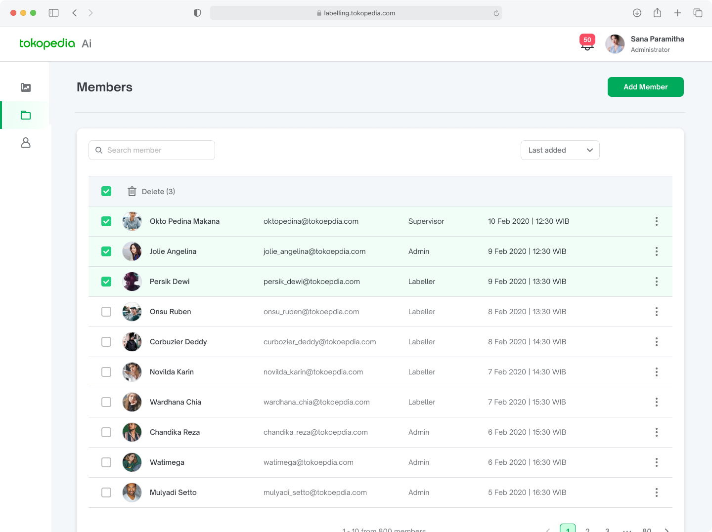
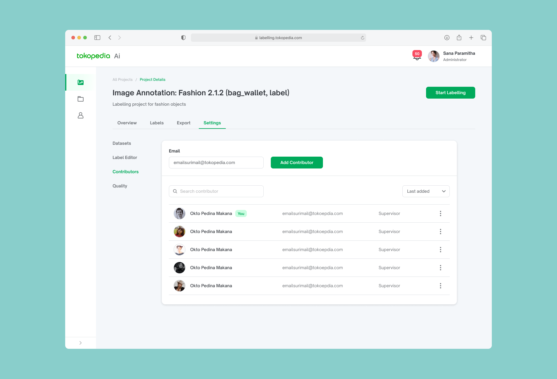
Admins can invite team members, assign roles (admin or labeler), and manage access per project.

Measurable improvement after launch
After the platform was shipped and adopted by the internal labeling team, the productivity improvement was significant.
| Metric | Before (Labelbox) | After (In-house) |
|---|---|---|
| Avg. time per image | 2 minutes | 30 seconds |
| Time to label 10,000 images (team of 5) | ~833 hours | ~208 hours |
| Reduction in labeling time | — | 75% |
| Team size for same output | 10 people | 5 people |
Beyond the numbers, shipping this tool removed a critical external dependency and gave Tokopedia full ownership of its labeling infrastructure — a foundation for the Tokopedia Enterprise roadmap to offer this as an external product.
Key Takeaways
Designing for repetitive workflows is a different skill.
Most UX work optimizes for infrequent or exploratory tasks. Annotation is the opposite — it's the same action, hundreds of times a day. That changes everything about what "good design" means: speed, predictability, and reducing cognitive load matter far more than visual polish.
Internal tools deserve the same rigor as consumer products.
There's a tendency to deprioritize internal tooling. But for the labelers who use this 8 hours a day, a clunky interface isn't a minor inconvenience — it's a daily drain on productivity and morale.
What I would do differently.
I wish I had more time to run usability testing with actual labelers on the editor specifically. Most of our validation was with the PM and engineering team, not the end users. Given that the editor is the most critical part of the experience, more direct testing there would have been valuable.